Email is the most powerful tool for acquiring customers. It trounces social media, PPC, and SEO. You want to convert the maximum number of readers to email subscribers and sales — and many bloggers and ecommerce founders turn to the ubiquitous popup to capture more leads. But do popups really convert more traffic to leads? […]
The post Do Popup Software and Plugins Help or Hurt Conversions & UX [Study] appeared first on .
Email is the most powerful tool for acquiring customers. It trounces social media, PPC, and SEO. You want to convert the maximum number of readers to email subscribers and sales — and many bloggers and ecommerce founders turn to the ubiquitous popup to capture more leads.
But do popups really convert more traffic to leads? And how does that affect the user experience?
To find the answer, I conducted a test to see how my site converts with and without popups. I also tracked other metrics such as bounce rate, page views per visit, and time on site that correlate with a positive user experience to see how users behave with and without popups.
Bonus: If you want to quickly set up a high-converting lead magnet for your opt-in forms, you should download my free Checklist Lead Magnet Template for both InDesign and Canva.
I used this template to help a client generate 490 organic leads in 31 days from one blog post.
Download it while it’s available for free for a limited time.
Click Here to download a free checklist lead magnet template for a limited time only!
Overview of the popup study
I’ve used popups, sliders, and other lead generation forms since launching my site. My first popups increased the number of signups on my site significantly, but back then, I didn’t track the number of signups and user behavior to prove it.
I wanted to see what would happen to my conversion rate, bounce rate, page views, and time on site if I removed the plugin. So to test out how well popups work, I recently removed all the popups from my site.
All the subscribers I generated during this 30-day period were organic. I didn’t use any ads to promote my content.
Here are my results.
Conversions before using a popup
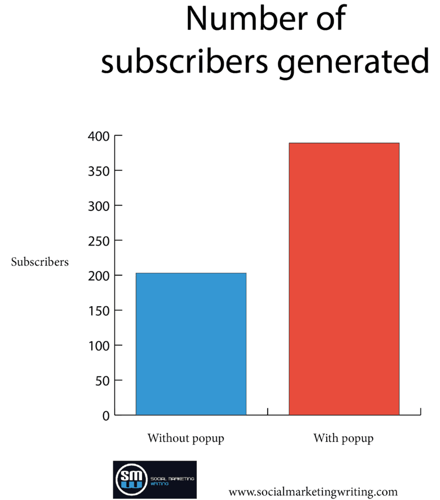
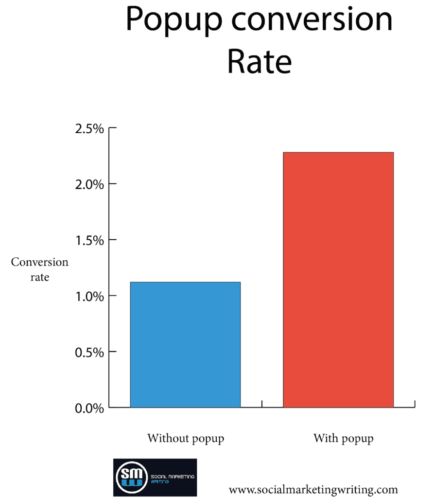
When I didn’t use a popup, my site generated 203 subscribers in a month. The conversion rate, at 1.12%, was respectable.
Conversions after using a popup
After adding the popup back to the site, I generated 389 subscribers the next month.
The increase was much more significant as the conversion rate jumped to 2.28%. Again, it’s because I received less traffic that month. I converted more readers to subscribers even though the site got less traffic in the following 30 days after I installed the popup. The decrease in traffic didn’t have any relation to my installing the popup.
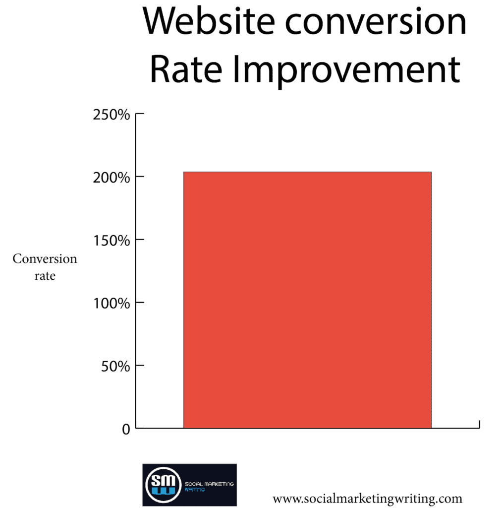
That’s a 203.57% increase.
How did adding popups affect user experience?
It’s not just about generating more leads; the user experience is also imperative, as only 2.28% of people signed up. You want the rest, 97.72% of visitors, to have a good experience too. As they might subscribe to your feed, follow your social media page, buy your products, or return if you retarget them.
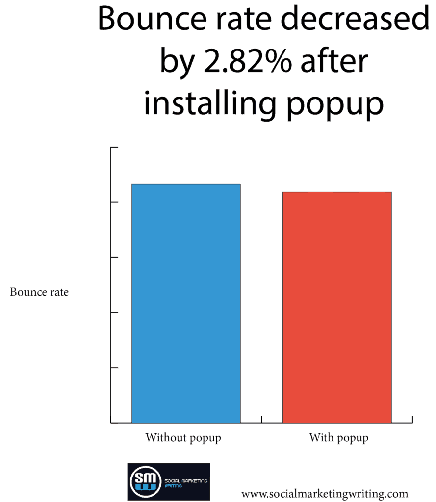
Many people shy away from installing popups on their websites because they’re worried about leaving a negative impression on readers. So, to measure the effect of popups on my site’s user experience, I also tracked bounce rate, page views per visit, and time on site. As shown in the below graph, the bounce rate decreased by 2.82% after installing the popup.
Page views per visit were more or less the same. It increased by 0.05 after installing the popup.
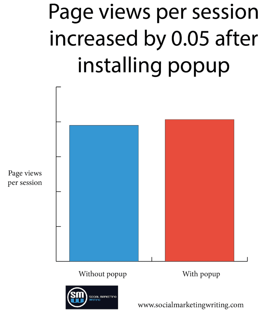
The data shows that the user experience was more or less the same with and without popups.
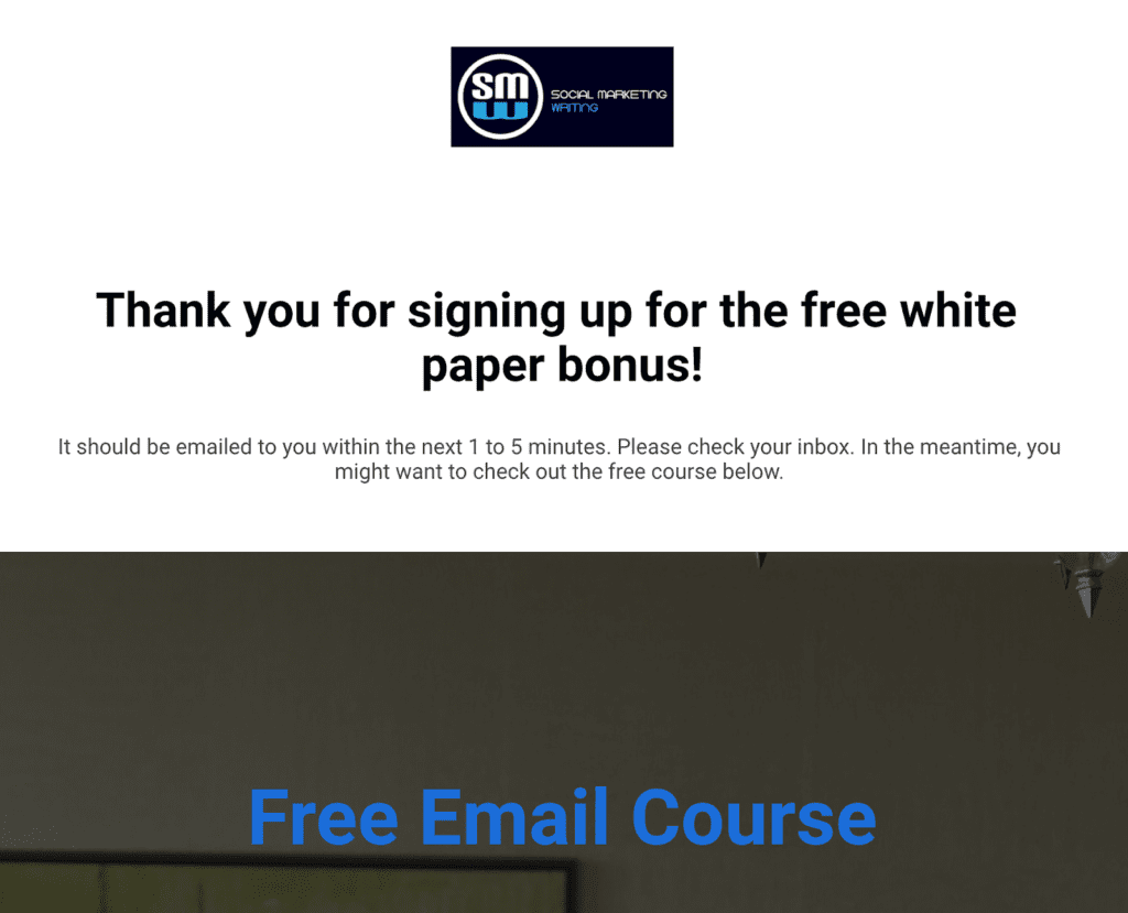
The slight improvement in bounce rate and page views could be because I redirect visitors to a dedicated thank-you page after they sign up, so I can track conversions as a goal in Google Analytics. The extra pageview contributes to the lower bounce rate.
Here’s an example of a thank you page. I thank people for signing up and sometimes promote other lead magnets that the subscriber might like. In this one, I promote a free course.
The average time on site decreased by 2 seconds after adding the popup. This could also be because more people are leaving the website to consume the lead magnet.
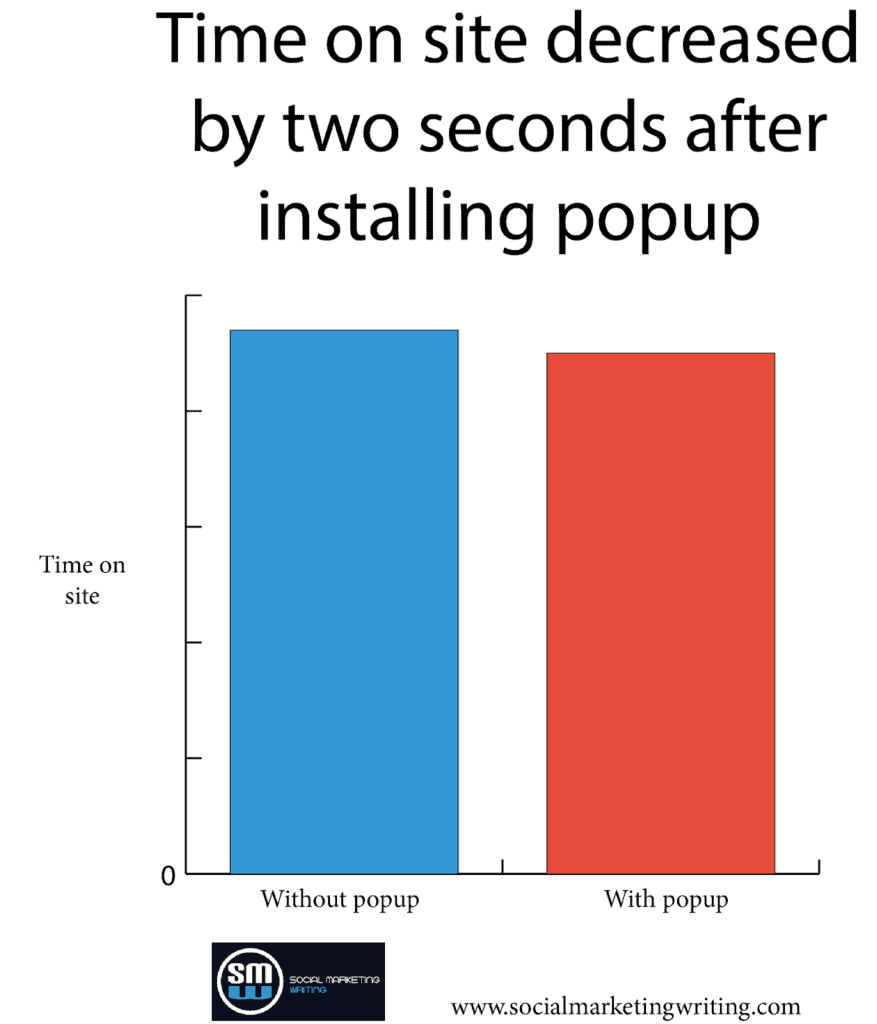
This shows that using popups won’t negatively affect the user experience. Just ensure you make it easy for people to close the popup by adding a prominent “X” button or some text.
Bonus: If you want to quickly set up a high-converting lead magnet for your opt-in forms, you should download my free Checklist Lead Magnet Template for both InDesign and Canva.
I used this template to help a client generate 490 organic leads in 31 days from one blog post.
Download it while it’s available for free for a limited time.
Click Here to download a free checklist lead magnet template for a limited time only!
Why conversion rates were low without the popup plugin
Without the popup plugin enabled, my conversion rates were much lower. To see why let’s look at the Tips for Selling on Instagram blog post as an example.
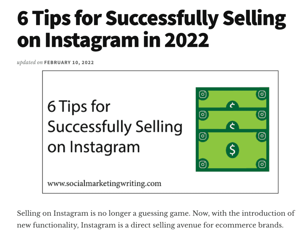
When I didn’t use a popup, with no relevant offer on the blog post that helped convert traffic, it converted at a measly 0.17%. When people landed on that post when I didn’t have the popup, they only saw the offers on the sidebar, which were mostly Pinterest and general social media related. I didn’t have anything relevant in the post, the header, and the footer.
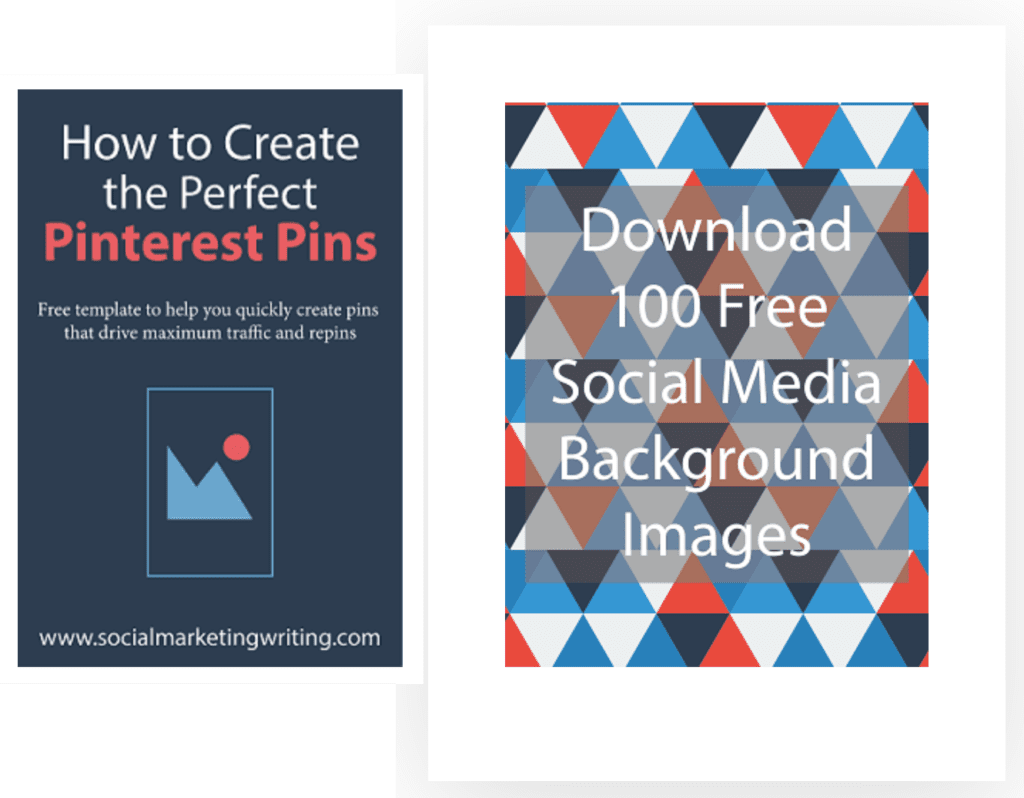
(It turns out very few people click on the calls to action in your sidebar — a fact I verified a while back using heat maps.)
But when I added a popup promoting Instagram background images, the conversion rate on the Selling on Instagram blog post shot up to 2.31% because the lead magnet gated behind the popup is highly relevant to the post’s topic.
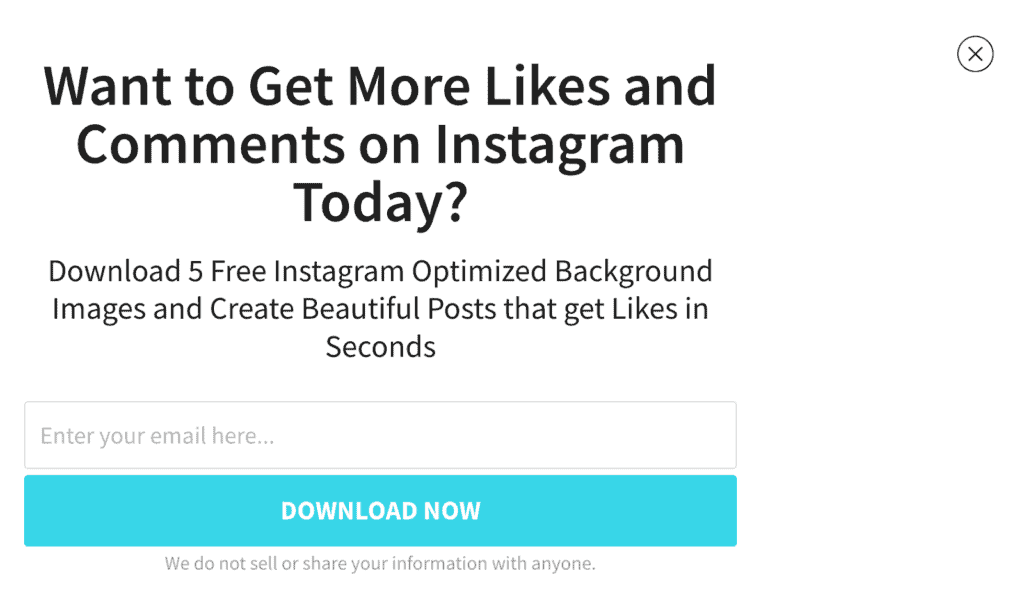
People that want to sell more on Instagram will want background images. They will make their job easier while creating posts. This popup also appears over the entire post after a timelapse of 10 seconds, meaning more people will see it.
My site still converts 1.12% of visits without the popup, as some other posts perform outstandingly. This was because they have a highly relevant content upgrade, like this post on How to Become a Social Media Manager, that converts at 11.73%.
A content upgrade is a lead magnet you create for one specific blog post. For example, this blog post has a lead magnet for getting clients as a social media manager.
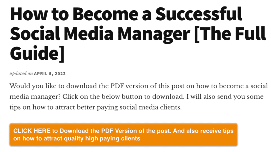
I recommend adding content upgrades to all the top-performing posts on your blog. They can seriously boost your conversion rates, as they did for my sites and my clients.
How I set up my popup software for maximum conversions
One of the reasons my conversion rates shot up significantly was that I used a variety of lead magnets and popups.
When most people set up popups on their website, they just set up one that shows up on every page. But I created several that promoted different lead magnets. As you saw in the example above, when people visited the blog post on Selling on Instagram, they saw a popup promoting Instagram background images. Likewise, when they visited the post How to Become a Social Media Manager, they saw a popup that promoted an ebook for creating a social media strategy.
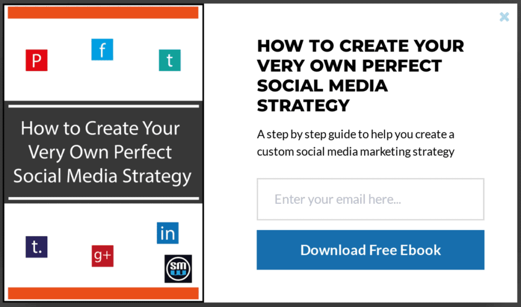
Some people who didn’t sign up for the content upgrade signed up for this, as creating a social media strategy is part of a social media manager’s job. After adding the popup, the conversion rate of this post shot up from 11.73% to 18.62%, clearly showing the value of using both popups and content upgrades.
If I used the same Instagram background images here, it wouldn’t convert this well.
I followed the same tactic on posts related to Pinterest as I promoted my Pinterest pin checklist + background images lead magnet.
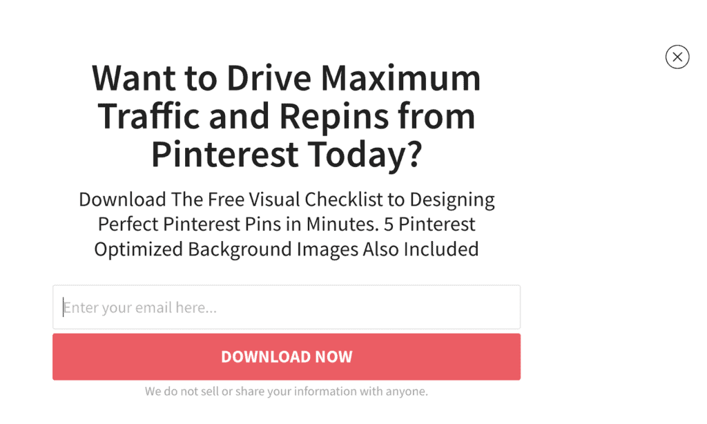
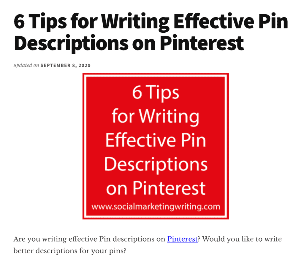
Conversions on my post, 6 Tips for Writing Effective Pin Descriptions on Pinterest, shot up from 0.29% to 3.94% after turning on the popup promoting the lead magnet Pinterest background images.
The main tool I use to set this level of targeting is OptinMonster. It has a feature for choosing different categories, tags, posts, and pages under which your popups show. I set my popups to appear based on the category the posts belong to — that way, I don’t have to go to each page and set one popup at a time. I can just set the Instagram background images popup to appear under all posts categorized under the Instagram category.
Since doing the study, I took advantage of another feature from OptinMonster that boosted subscribers even further. It lets you promote a different popup to someone who closed the initial popup. So, I promote a different lead magnet to people who close the initial one, and more people sign up.
If you want to get even more specific with your popup targeting, you should check out RightMessage. It takes popups and opt-in forms to another level.
Note: When using popups, only use regular popups and sliders. Don’t use welcome mats, as they’re annoying. Welcome mats are popups that appear at the top of the site instead of the exact spot where the reader is. They force readers back to the top of the page, and when they close the welcome mat, they need to find their way back to where they were reading, which can quickly become frustrating. But with a popup, they remain exactly where they are on the page even after closing the popup and can easily continue reading.
An alternative is to create a welcome mat embedded at the top of the page which appears as soon as they visit the website.
Should you use a popup builder?
If your goal is to sell more products and services, then converting as much traffic as you can into email subscribers should be your primary goal. An email list is the best marketing asset for any business, which is why you should create lead magnets and set up popups, sliders, and other opt-in forms on your website.
You can skip using popups if you have a well-planned retargeting strategy, as you can reach these people even without the signup. But if you want to save your ad budget and run more targeted ads, you should use a combination of both, as you can serve highly relevant ads to subscribers based on their email behavior.
Increasing my conversion rate to 2.28% was only a tiny step. I want to improve my conversion rate further, as I constantly help clients achieve 5%+ blog conversion rates through other methods, such as content upgrades. So, I am creating more content upgrades and experimenting with other opt-in forms on Social Marketing Writing. I will release another report about these email capture techniques soon, so stay on the lookout for my latest posts.
Bonus: If you want to quickly set up a high-converting lead magnet for your opt-in forms, you should download my free Checklist Lead Magnet Template for both InDesign and Canva.
I used this template to help a client generate 490 organic leads in 31 days from one blog post.
Download it while it’s available for free for a limited time.
Click Here to download a free checklist lead magnet template for a limited time only!
![Do Popup Software and Plugins Help or Hurt Conversions & UX [Study]](https://socialmarketingwriting.com/wp-content/uploads/2022/12/The-Ultimate-Guide-to-Social-Media-Branding.png)
The post Do Popup Software and Plugins Help or Hurt Conversions & UX [Study] appeared first on .
